
A call to action (CTA) is a critical element in marketing, guiding users toward taking a specific action. Whether it’s visiting a website or storefront, making a purchase or call, or something else, CTAs should motivate a user to engage further with your business.
Not all CTAs are created equal, however, and there are proven ways to generate more engagement through good CTA writing. Though it may seem like minor word choice, the right CTA can be the difference between a conversion versus disinterest.
In this guide to effective CTAs, we’ll explore the ins and outs of calls to action including where to place them, how to craft an effective one, and whether it’s okay to have multiple CTAs on one page or marketing material. We’ll end with a list of the best CTA examples.
Here’s what this guide will include:
- What is a call to action?
- How to write a good CTA
- Where should you put a CTA
- Is it okay to have multiple CTAs?
- Strong action verbs
- Best CTA examples
What is a Call to Action (CTA)?
A call to action (CTA) is a prompt that appears on a website or in marketing materials (e.g., email, billboard campaign, social media post, or one-pager) that encourages users to take a specific action. This action can take the form of:
- Signing up for a newsletter
- Making a purchase
- Downloading an ebook
- Following on social media
- Downloading an app
- Making a phone call
- Setting up an appointment
- And many more
The primary goal of a CTA is to convert visitors/viewers into leads or customers. Common generic examples include “get started,” “join today,” and “learn more.” Users may then move down the sales funnel by clicking a button or filling out a form, for instance.
Another type of call to action not to forget in all of your campaigns are websites and phone numbers, which can be accompanied by phrases like “click here” and/or “call now.” For print, video, and street-level OOH media, QR codes can be an excellent call to action.
Why CTAs are Important
CTAs aren’t throwaway phrases that you tack onto the end of your content or slap on a sign. They serve an essential purpose because they:
- Guide users through the customer lifecycle
- Improve user engagement
- Increase conversion rates
- Provide measurable actions for marketing campaigns
Without strong CTAs, users may leave a website or abandon a piece of content without taking any meaningful action, resulting in lost opportunities for engagement and conversion.
How to Write a Good Call to Action
To craft an effective CTA, you need to understand your audience, be clear and concise, and create a sense of urgency. If you haven’t already created a buyer persona, this is definitely the time to do so.
If you find yourself sitting at the keyboard, drawing a blank, here are some tips for writing an effective CTA:
1. Know Your Audience

To craft a CTA that resonates with your target audience, you must first gather insights into their demographics, preferences, behaviors, and pain points. This allows you to tailor your message to meet their specific needs and motivations. If a user doesn’t feel that they’ll gain anything from engaging with you, they won’t act.
2. Be Clear and Specific
Your CTA should leave no room for confusion. Use simple, direct language that tells the user exactly what to do. Avoid jargon, complex phrases, or ambiguous terms that might confuse your audience.
In addition to being clear about the action, specify the benefit the user will receive by taking that action. This adds value to your CTA and increases its attractiveness. For instance, “Get Your Free Guide Now” not only tells the user what to do but also what they will gain immediately by doing so.
3. Create a Sense of Urgency
When users feel that they might miss out on something valuable, they are more likely to act quickly. Phrases like “Get started now,” “limited time offer,” or “join today” can create urgency and prompt immediate action.
Scarcity is a powerful psychological trigger that can drive users to act fast. If your offer is limited by quantity, make this clear in your CTA. Phrases like “Only a Few Left,” “Limited Stock,” or “While Supplies Last” create a fear of missing out (FOMO), which can motivate users to take action promptly.
4. Use Strong Action Verbs
Start your CTA with powerful verbs like “Download,” “Register,” “Buy,” or “Subscribe” to make it more compelling. They leave no ambiguity about what you want the user to do, providing clear instructions and driving immediate responses. You can create even more urgency by pairing an action verb with a time-sensitive word like “now” or “immediately.” We’ll dive into examples of more CTA verbs later.
5. Make it Stand Out

Color is one of the most effective ways to draw attention to your CTA. Use colors that contrast sharply with the rest of your page but still align with your overall branding. Design your CTA button to stand out with contrasting colors, large fonts, and enough white space around it.
Use large, bold fonts that are easy to read at a glance. Avoid overly decorative fonts that might be hard to decipher. The text should be clear and legible, even for users with visual impairments or those viewing on smaller screens. If your CTA appears on a button, ensure that it’s obvious that it’s a button by adding a hover-over feature or a drop shadow.
For more on effective ad design, check out our blog post.
Where Should You Put a Call to Action?
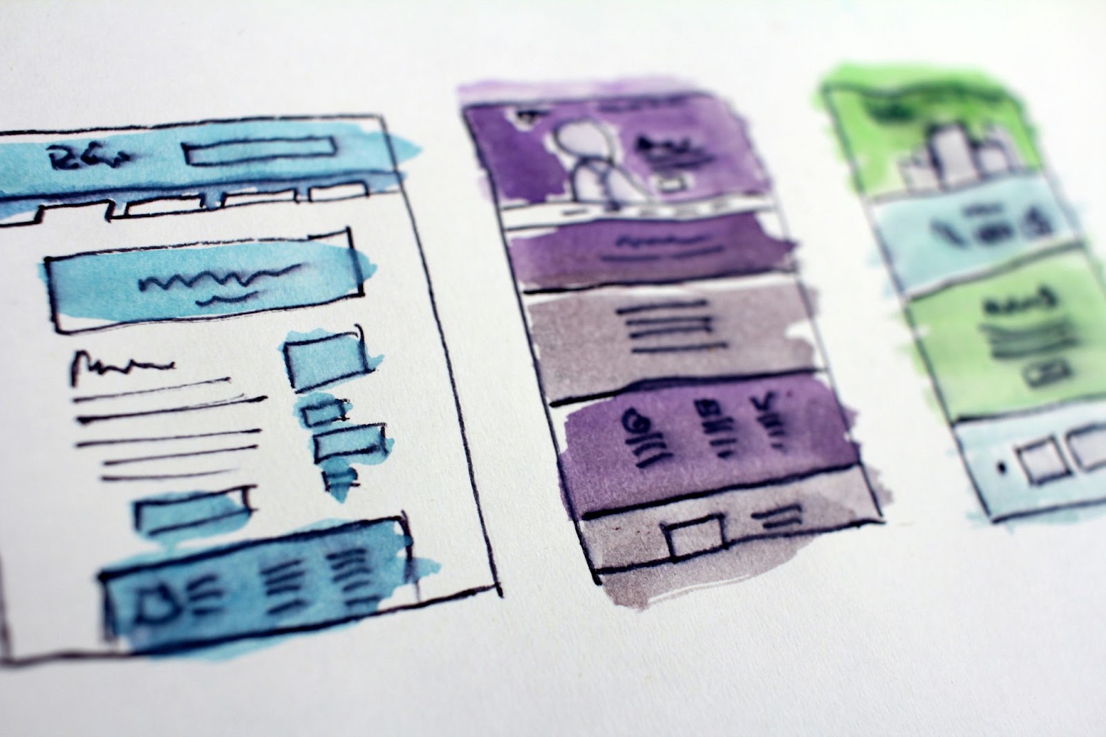
Placement of your CTA can significantly impact its effectiveness. If you place it too early in your content, people might not be convinced of the benefits that will come from acting. Place it too far down or in a non-obvious location, and people might not notice it or scroll far enough. Consider these strategic locations:
Above the Fold
The term “above the fold” originates from the newspaper industry, where it refers to the top half of the front page. In the context of web design, “above the fold” refers to the portion of a webpage that is visible without scrolling. This area is prime real estate for CTAs because it is the first thing visitors see when they land on your page.
Placing a CTA above the fold ensures maximum visibility and immediate engagement potential. Since users often decide whether to stay on a page within the first few seconds, having a prominent, compelling CTA in this space can significantly increase the chances of conversion.
End of Content
Placing a CTA at the end of your content can be a highly effective strategy because it targets users who have fully engaged with your material. However, what’s extremely important here is that your content must be engaging and relevant, otherwise people won’t get that far to begin with.
By the time users reach the end of an article, blog post, or other content piece, they are often more informed, interested, and ready to take the next step. This placement leverages the momentum built through the content, making it a natural point to prompt further action.
Pop-ups and Slide-ins
For digital marketing, pop-ups and slide-ins can be effective at grabbing attention because they appear prominently on the screen, often overlaying the content. These CTAs can be triggered by various user actions, such as scrolling down a certain percentage of the page, spending a specific amount of time on the site, or when attempting to exit the page (exit-intent pop-ups).
Ensure these are timed well and relevant to avoid annoying the user, which may result in a negative association with your brand.
Within the Content
Placing CTAs within relevant sections of your content aligns the call to action with the user’s interests and intent, increasing the likelihood of engagement. Content-driven CTAs can provide additional value to users by offering related resources, further information, or opportunities to engage deeper with your brand. Users are more inclined to take action when it feels like a logical next step in their journey.
Is it Okay to Have Multiple CTAs?

Understandably, many people are apprehensive about having multiple CTAs on one page. On the other hand, some people like the phrase things in many different ways in the hopes that at least one will resonate with a user.
Generally, it’s okay to have more than one CTA, but it needs to be done tactfully. For example, a university may have an admissions page that has two buttons: “Schedule an info session” and “Apply Now.” These can appeal to users who are at different points in their journey—whether they need more information or they feel ready to commit.
Here are some other tips to keep in mind if you decide to include multiple CTAs on one page:
- Prioritize your CTAs: have a primary CTA that is the main focus, and secondary CTAs that support but don’t overshadow the main one.
- Avoid overwhelming users: too many CTAs can confuse or overwhelm users. Keep it simple and ensure each CTA has a clear purpose.
- Test and optimize: A/B test different CTA combinations to see what works best for your audience. Optimize based on performance data.
Strong Action Verbs

As mentioned earlier, strong action verbs are essential for making your CTA compelling and persuasive. Similar to authoring a novel, writing a CTA requires careful attention to word choice to give rise to a certain feeling. Action verbs convey a sense of urgency and motivate users to take immediate action.
Here are some examples of powerful action verbs that can enhance the effectiveness of your CTAs:
Download
This verb is highly effective for promoting digital products like ebooks, software, or guides. It implies instant access to valuable content.
Register
Ideal for events, webinars, or membership sites, “register” creates a sense of formality and commitment, encouraging users to sign up.
Buy
Direct and straightforward, “buy” works well for e-commerce sites, pushing users towards making a purchase with confidence.
Subscribe
Perfect for newsletters, blogs, and video channels, “subscribe” suggests an ongoing relationship and access to regular content updates.
Join
This verb is great for community-based platforms, clubs, or loyalty programs. It invites users to become part of a group or movement.
Start
“Start” is a versatile verb that can be used for free trials, courses, or new projects. It signals the beginning of a journey or experience.
Try
Using “try” can lower the perceived risk for users, making it ideal for promoting trial offers or demo versions of products.
Learn
This verb appeals to users looking for information or education, making it effective for courses, tutorials, and informative content.
Discover
“Discover” suggests uncovering new information or experiences, enticing users to explore what your service or product has to offer.
Explore
Similar to “discover,” this verb encourages users to dive deeper into your content, product range, or website.
Best CTA Examples
Some of the strongest brands we know continue to expand by leveraging smart CTAs. Let’s look at some of the best CTA examples that have proven to be effective:
Example 1: Dropbox
CTA: “Sign Up Free”
Dropbox uses a clear and concise CTA that highlights the key benefit (free trial) and appeals to businesses looking for collaboration tools.
Example 2: Netflix
CTA: “Join Free for a Month”
Netflix creates urgency and appeals to users with a risk-free trial, encouraging them to experience the service without commitment.
Example 3: HubSpot
CTA: “Get Started Free”
HubSpot’s CTA is inviting and highlights the immediate value (free tools), making it appealing for users to try their platform.
Example 4: Amazon
CTA: “Add to Cart”
Amazon’s iconic “Add to Cart” button is simple, direct, and positioned strategically next to every product, making the purchasing process seamless.
Wrapping Up: Creating CTAs that Pop
Effective CTAs are vital for driving conversions and achieving your marketing goals. At the end of the day, much of it may come down to trial and error. What works well for some businesses, might not be as effective for others. Remember: understanding your audience and their needs is paramount to even begin formulating your CTA. If you keep these proven tips in mind when writing, you’re more likely to see engagement.